As Senior Design Lead, I spearheaded UX innovation for AT&T’s flagship mobile app, a Fortune 500 media and telecom product used by tens of millions of customers. My role centered on transforming a historically account-focused app into a modern, human-centered platform that seamlessly integrates shopping, support, and account management into one intuitive, mobile-first experience.
Through field research, competitive analysis, design system evolution, and stakeholder alignment across multiple product teams, I delivered new shopping experiences, rearchitected support flows, and introduced new interface patterns that improved usability, personalization, and accessibility standards. I also onboarded and mentored international designers who contributed to the delivery.
This work established a foundation for AT&T’s next generation of customer-facing mobile experiences.
AT&T’s mobile app historically functioned as a utility for account management: bills, usage, devices, and plans. But customer expectations had evolved—people now expect mobile apps to act as assistants: guiding, recommending, and simplifying tasks end-to-end.
Key Challenges
- Fragmented IA across account, shop, and support screens
- Low discoverability of shopping options inside an account-first architecture
- Design system components that were not flexible or mobile-friendly
- Accessibility inconsistencies, especially around navigation patterns
- Complex product categories (wireless, internet, TV, accessories, promos)
- Legacy visual styles that no longer aligned with customer mental models
AT&T needed a unified, intuitive mobile experience that supported customers through their entire lifecycle—from discovery to purchase to troubleshooting.
Senior UX/UI Design Lead
- Owned the end-to-end redesign of the Shop, Support, Deals, and Trade-in / Upgrade flows
- Led IA restructuring to unify flows across product lines
- Conducted research, audits, and visual explorations
- Modernized the design system with mobile-friendly components
- Facilitated cross-functional collaboration with product managers, engineers, and international designers
- Delivered high-fidelity prototypes for usability testing
- Mentored remote designers on workflow, design rationale, and UX best practices
My responsibility was not only to design screens — but to define the structure, logic, and interaction models shaping the future mobile experience.
Research Inputs
- Usability testing from prior phases
- Competitive analysis of best-in-class mobile apps (Target, Apple Store, Amazon, T-Mobile)
- Deep review of the internal design system
- Field insights around how customers shop and troubleshoot
- Card sorting + IA validation
- Stakeholder interviews with product, marketing, and CX teams
Experience Principles Defined
1. Act like an assistant — guide users with clarity, not complexity
2. Mobile-native interactions — tap, swipe, scroll patterns users already know
3. Keep users in context — reduce page-hopping and unnecessary redirection
4. Accessible and inclusive — ensure readability, contrast, and component flexibility
5. Personalized for the user — reflect device ownership, account details, and plan status
These principles anchored the redesign across categories.
The existing IA scattered shopping and support content throughout the app. I restructured the architecture around user intent, prioritizing:
- What do I need to do right now?
- What information helps me make a decision?
- What tasks do customers repeat most often?
IA Improvements Included:
- Clear prioritization of top-level categories
- New navigational cards that present content visually, not as lists
- Contextual personalization (e.g., device name, account details, eligibility)
- Streamlined flows with fewer steps and predictable patterns
This new IA laid the groundwork for all visual and UX enhancements that followed.
After redefining the IA, I uplifted the visual system to be more flexible, responsive, and mobile-native.
Key Decisions
- Introduced tappable cards as the primary interaction model
- Simplified visual hierarchy using clearer typography and spacing
- Elevated imagery + iconography to make dense telecom content easier to skim
- Reduced reliance on desktop-first design system components
- Aligned interactions to familiar app behaviors (carousel, cards, nested drawers)
This made the experience more modern, more intuitive, and more aligned with user expectations.
Goal: Make shopping feel integrated, quick, and contextual — without pulling the user away from their main experience.
New Features & Improvements
- Card-based navigation for product categories
- Clearer plan and device comparisons
- Personalized content based on user eligibility
- Guided flows that recommend next steps (upgrade, add a line, trade in, etc.)
The redesigned Shop experience made discovery easier and reduced friction for browsing and purchasing.

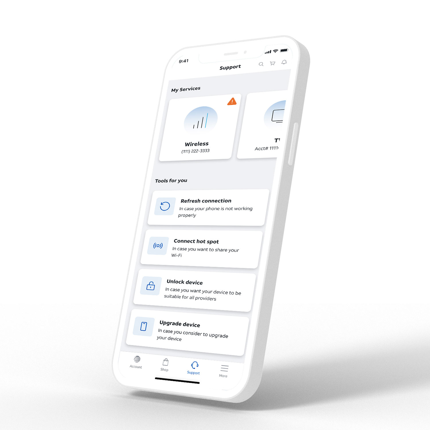
Customers often turn to the app during moments of frustration. The Support redesign focused on calm clarity:
- Clear categories
- Shorter paths to solutions
- Self-service before escalating to assisted support
- Modular support content blocks that could flex across topics
- Clearer entry points from Account, Shop, and Home
This ensured support was no longer buried — it became a proactive, guided experience.

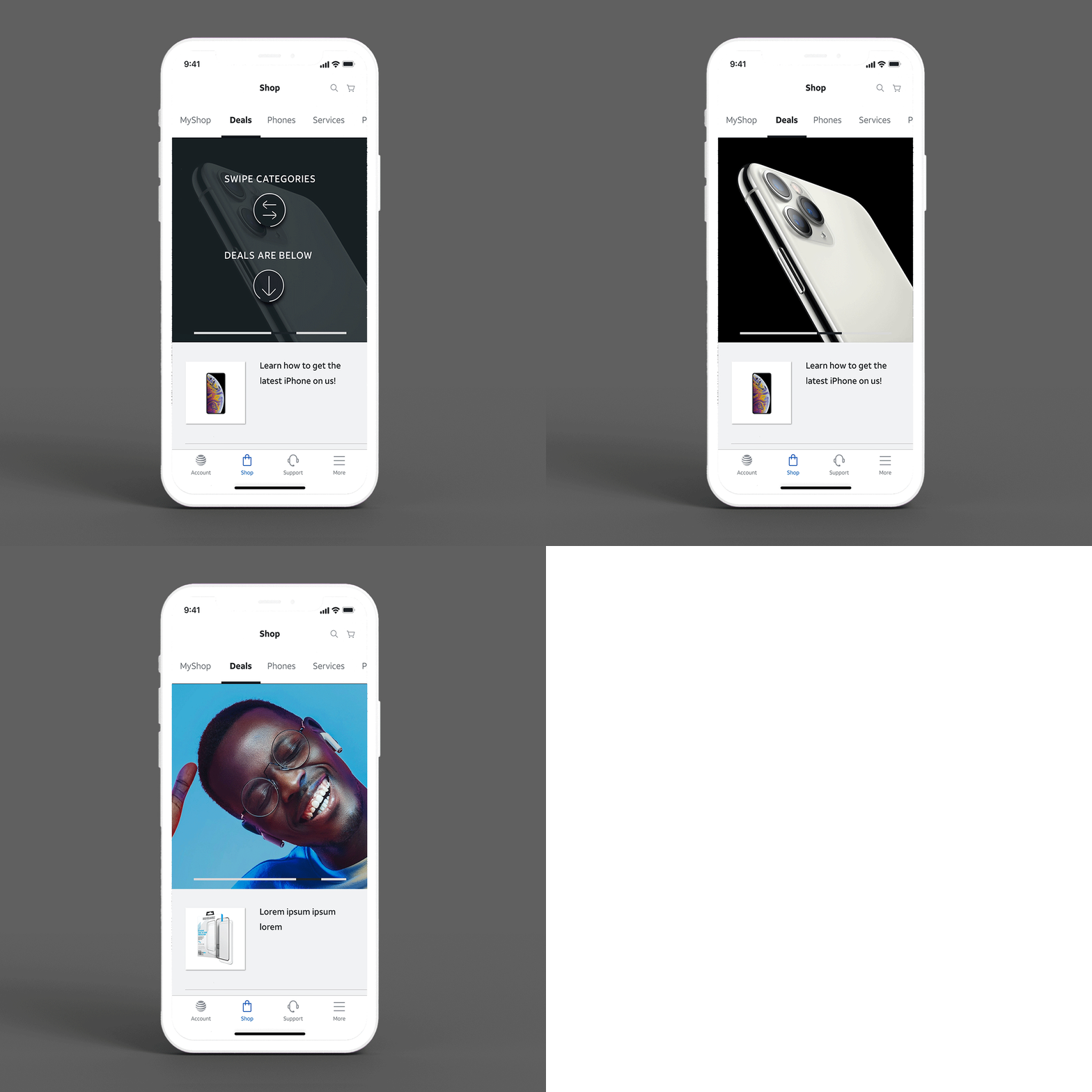
This was one of the most innovative additions to the app.
Inspiration
During competitive research, I noticed Target’s mobile app catalog feature showed:
- A visual catalog category at the top
- Items organized below within the same page
Design Decisions
- Adapted this interaction to telecom use cases
- Created a scrollable “category banner” at the top
- Displayed deals within the same context, not loading new pages
- Allowed promo videos in category blocks (e.g., new iPhone launch)
- Built high-fidelity prototypes for testing
User Testing Insights
- Users loved staying in one page
- Some needed initial “how it works” context
- After learning, the interaction felt natural and engaging
This feature combined exploration, education, and utility in a single, seamless pattern.

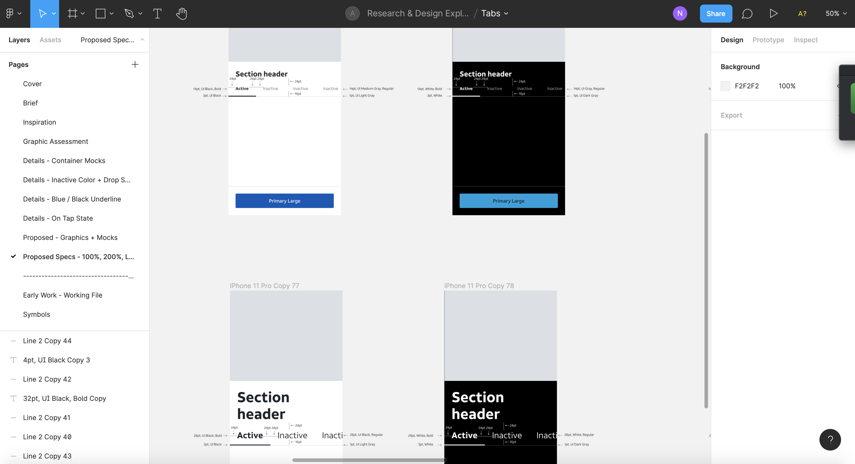
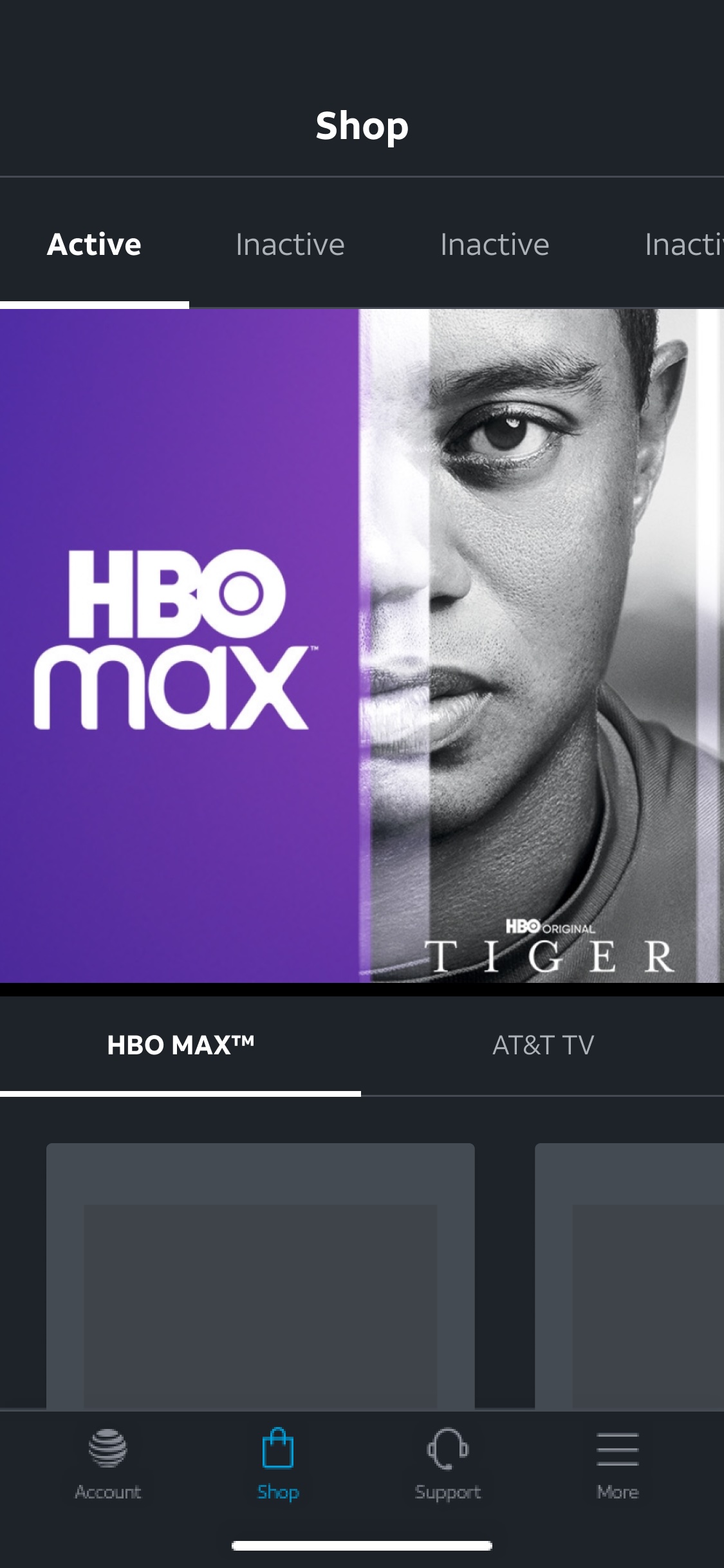
While working across flows, I discovered that the existing tab component:
- Lacked flexibility
- Wasn’t accessible
- Didn’t scale across multiple use cases
My Contribution
- Conducted a component audit
- Defined problems with “why statements”
- Facilitated team input + feedback
- Proposed multiple visual and interaction options
- Documented do/don’t guidance
- Built responsive component in Figma
This updated tab component became part of the broader design system — improving accessibility, usability, and cross-team consistency.


This flow had strong bones, but needed refinement to fit into the new patterns.
Improvements Delivered
- Added personalized device and account details
- Provided option to trade in “a different device”
- Introduced drawers to display condition requirements + legal terms
- Enabled real-time price changes as users completed steps
- Organized insurance options into clear categories (Advantage vs. Basic)
- Tested category naming to validate comprehension
- Integrated the updated tab component for consistency
These enhancements made a complex flow far easier to understand and complete.

- More intuitive and personalized mobile experience
- Clearer pathways between account, shop, and support
- Reduced navigational confusion across categories
- Design system improvements adopted by multiple teams
- Positive usability feedback on deals, tabs, and card-based patterns
- Enabled faster design iteration
- Elevated design system consistency
- Onboarded and supported international designers
- Improved communication between product, design, and engineering
As a design leader working in high-volume operational environments, I learned:
- Great mobile UX requires mobile-native thinking, not scaled-down desktop components
- Navigation must reflect user intent, not internal org structure
- Small components create large impact when maintained within a systematic design framework
- Testing early reduces confusion later, especially for new patterns
- Mentorship strengthens cross-border collaboration and creates more cohesive work
- Innovative ideas often come from unexpected places — like a retail app influencing a telecom design
This project exemplifies my work as a Senior Design Lead: balancing innovation with system constraints, elevating visual and UX quality, advocating for accessibility, advancing the design system, mentoring designers, and orchestrating complex flows across shopping, support, and account management.
The result is a mobile experience that feels clearer, more modern, and more aligned with what customers expect from a leading telecom brand.