
As Senior UX/UI Designer (Lead) with Stratfield Consulting, I led the end-to-end UX transformation of kitchen operations for Chick-fil-A, a Fortune 500 quick-service restaurant brand. My mandate: modernize legacy kitchen tools, reduce training burden, improve accessibility, and equip 250,000+ team members across 2,500+ restaurants with clearer, faster, more reliable digital systems.
Working remotely yet deeply embedded with operations, training, and technology teams, I designed a modular, scalable UX platform that streamlined production workflows, accelerated onboarding, reduced operational errors, and strengthened system trust in high-volume kitchen environments.
Objective: Ground the redesign in the lived experience of operators, kitchen leads, and team members.
To ensure the experience reflected real operational needs, I conducted a blended research program encompassing:
- Field research across multiple restaurant locations, observing breading workflows during peak demand and identifying patterns of workarounds, friction, and errors.
- Interviews & surveys with team members, kitchen leads, and operators to understand knowledge gaps, accessibility issues, and inconsistencies across restaurants.
- Quantitative data analysis on training throughput, error rates, and interface usage.
- Persona development (New Team Member, Kitchen Lead, Operator) capturing motivations, pressures, and environmental constraints.
- Journey mapping to visualize critical moments where digital tools failed to support speed, clarity, and confidence.
- Training required long, manual sessions and varied dramatically by location.
- Legacy interfaces were inconsistent, visually cluttered, and sometimes ignored or turned off.
- Data reliability issues during peak service led to high error rates.
- Accessibility gaps (color-coded only signals, small text, weak contrast) disproportionately affected accuracy and speed.
- Operators needed a more predictable system that supported local variations without fracturing consistency.
These insights shaped the core design direction: tools must be simple, fast, inclusive, and optimized for high-volume realities.
.jpeg)
.jpeg)
Goal: Establish a unified experience strategy aligned with Chick-fil-A’s operational excellence and brand promise.
I organized and facilitated a cross-functional workshop with 13 leaders from operations, training, engineering, and UX. This collaboration established:
- North Star Vision: Empower every team member to deliver exceptional service quickly, confidently, and inclusively.
- Experience Principles: Speed through Simplicity, Accessible for All Hands, Consistency at Scale
- Digital Ecosystem Map: Connecting kitchen stations, training modules, dashboards, and reporting tools to ensure new designs were interoperable and scalable.
This alignment forged a shared understanding of user needs, operational constraints, and long-term product direction — enabling faster decision-making and more efficient cross-team execution.
Strategic Shift: From fragmented unreliable tools → to a unified, modular, accessible platform.
I designed the platform using a systems-first approach:
Modular design system optimized for kitchen environments:
- Large tap targets
- High-contrast typography
- Accessible color/contrast patterns
- Iconography for color-blind users
- Components built for quick readability under time pressure
Design operations for scale:
- Definition of rollout priorities
- Training-friendly modular features
- Governance around accessibility standards and component reuse
Agile prototyping & iterative testing:
- Weekly prototype reviews
- Feedback loops with team members and leads
- Continuous refinement based on operational data and kitchen observation
This systems-thinking approach ensured consistency across thousands of restaurants while still enabling restaurant-specific flexibility.
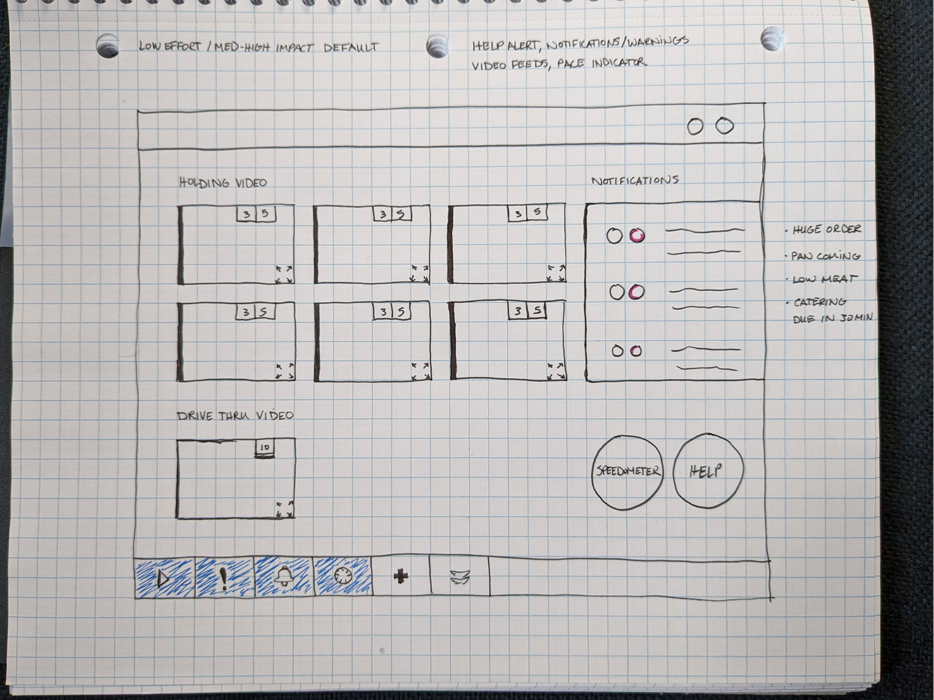
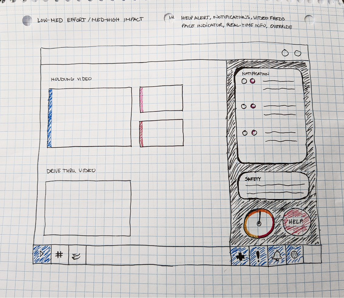
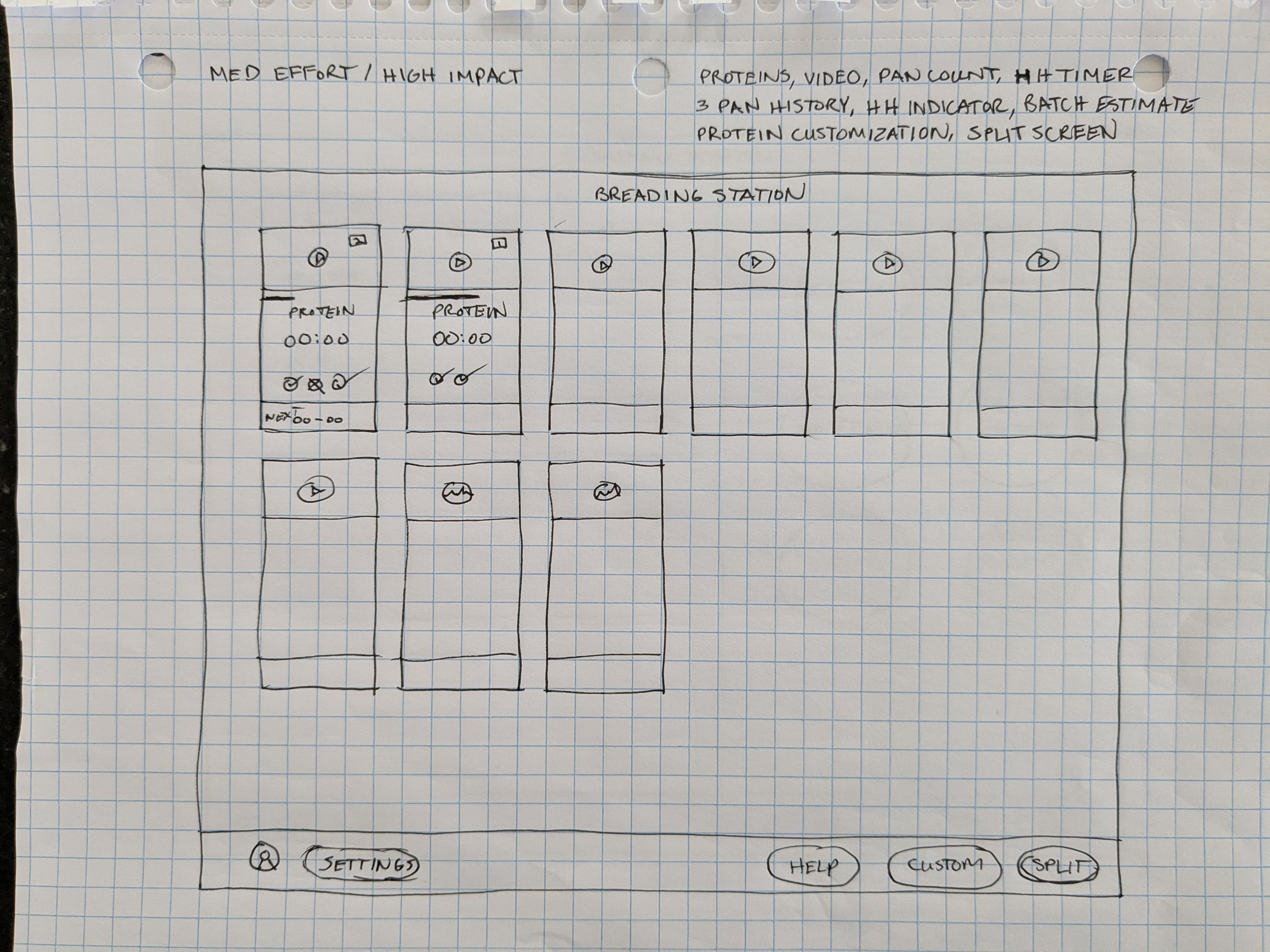
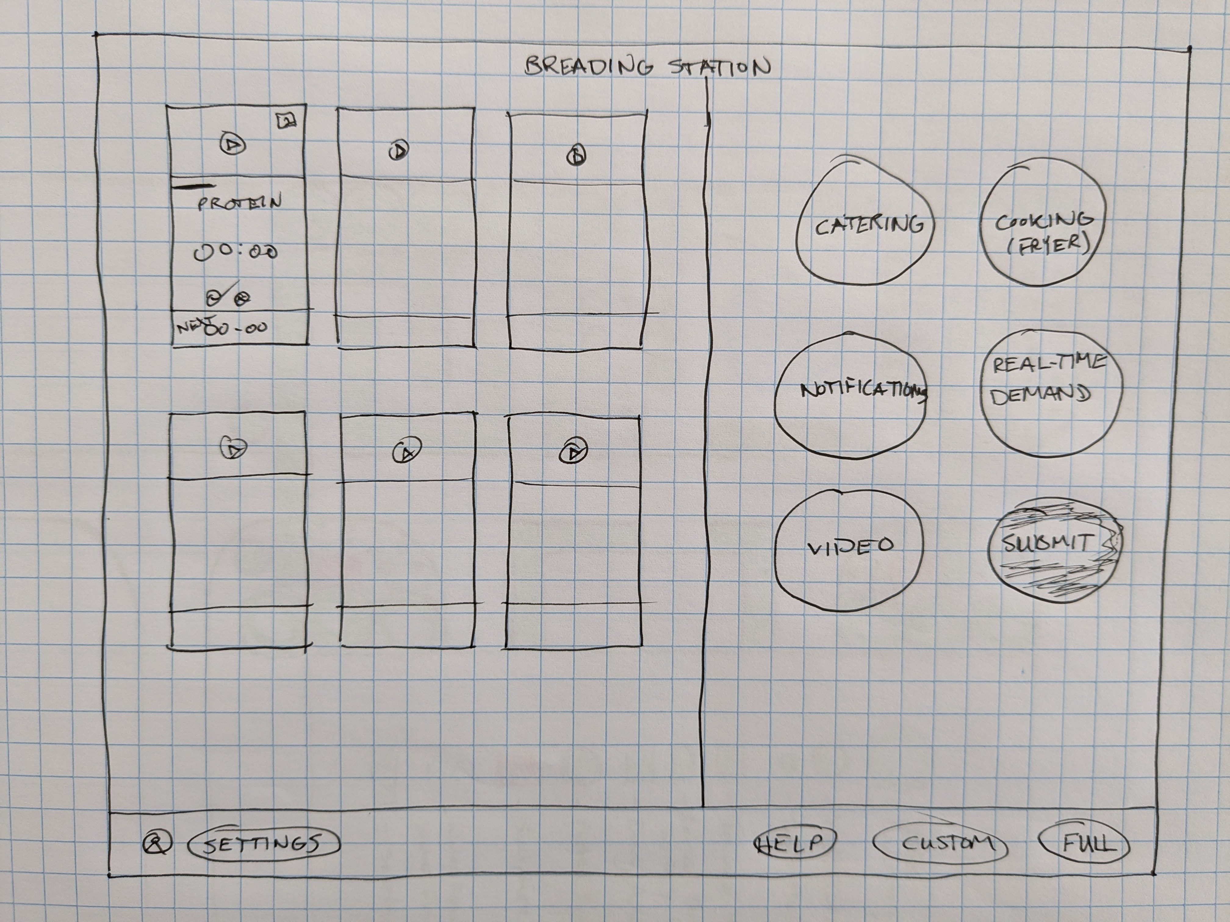
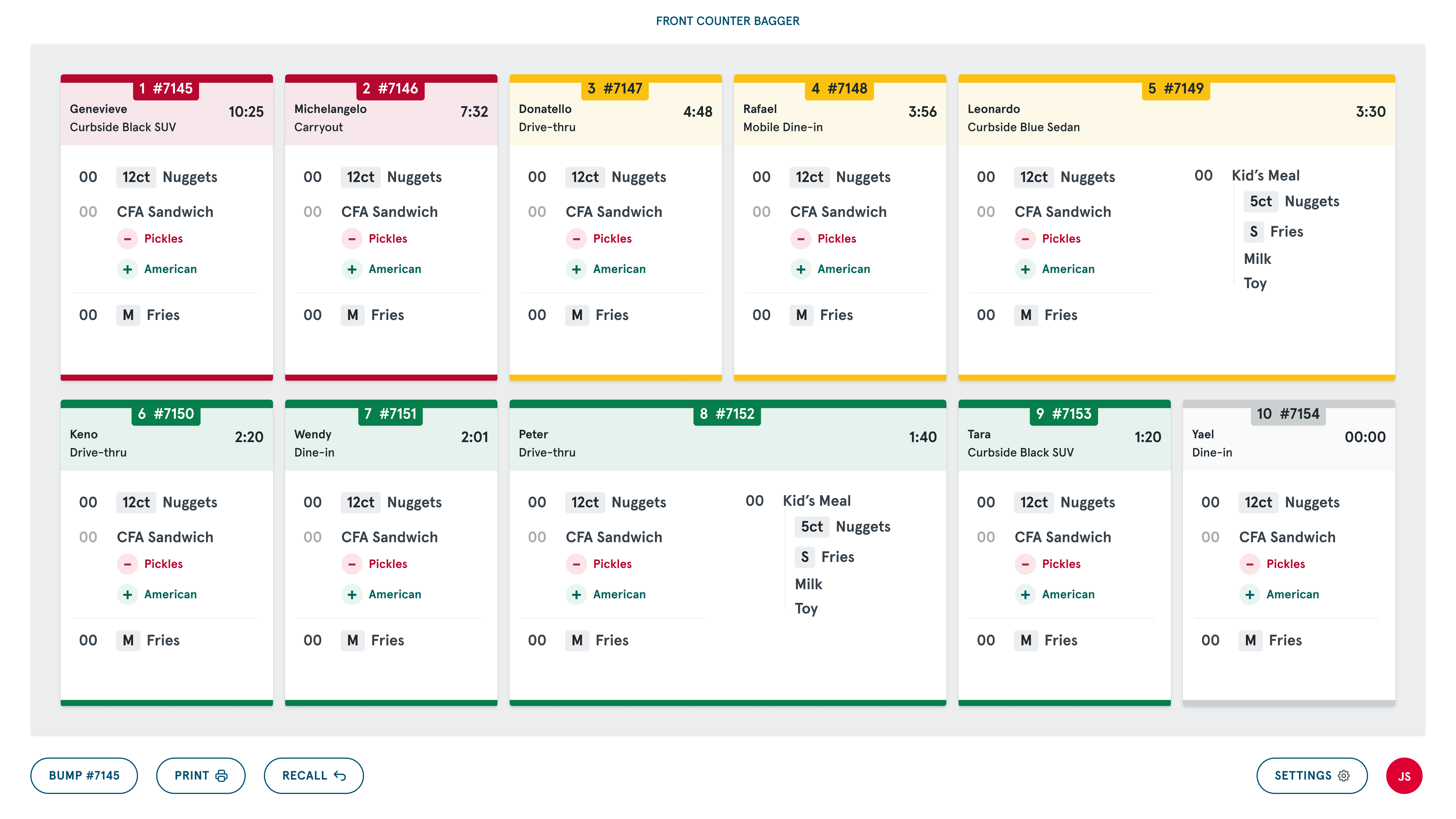
Challenge: Legacy breading station tools provided unreliable data, lacked data, visually unclear, and often distrusted by staff during peak hours.
Solution: A re-engineered breading station interface designed for speed, clarity, accessibility, and accuracy.

.png)
.png)
.jpg)
.png)
.png)
- New touchscreen workstation replacing outdated tablets, improving visibility and interaction reliability.
- Re-architected information hierarchy to clearly display mandatory station information (pan count ranges, protein indicators, timers).
- Optional split-screen mode for non-mandatory information tailored to restaurant needs.
- Accessible color system eliminating problematic red/green dependencies.
- Iconography to support universal comprehension under high stress.
- Restaurant-level customization for pan configuration, proteins, and batch vs. made-to-order modes.
- Data-confidence design system displaying protein production ranges (vs. single-point estimates) to improve forecasting accuracy and rebuild operator trust in system recommendations.
- 40% reduction in operational errors (aka pan targets)
- Increased trust and adoption of digital tools during high-volume periods
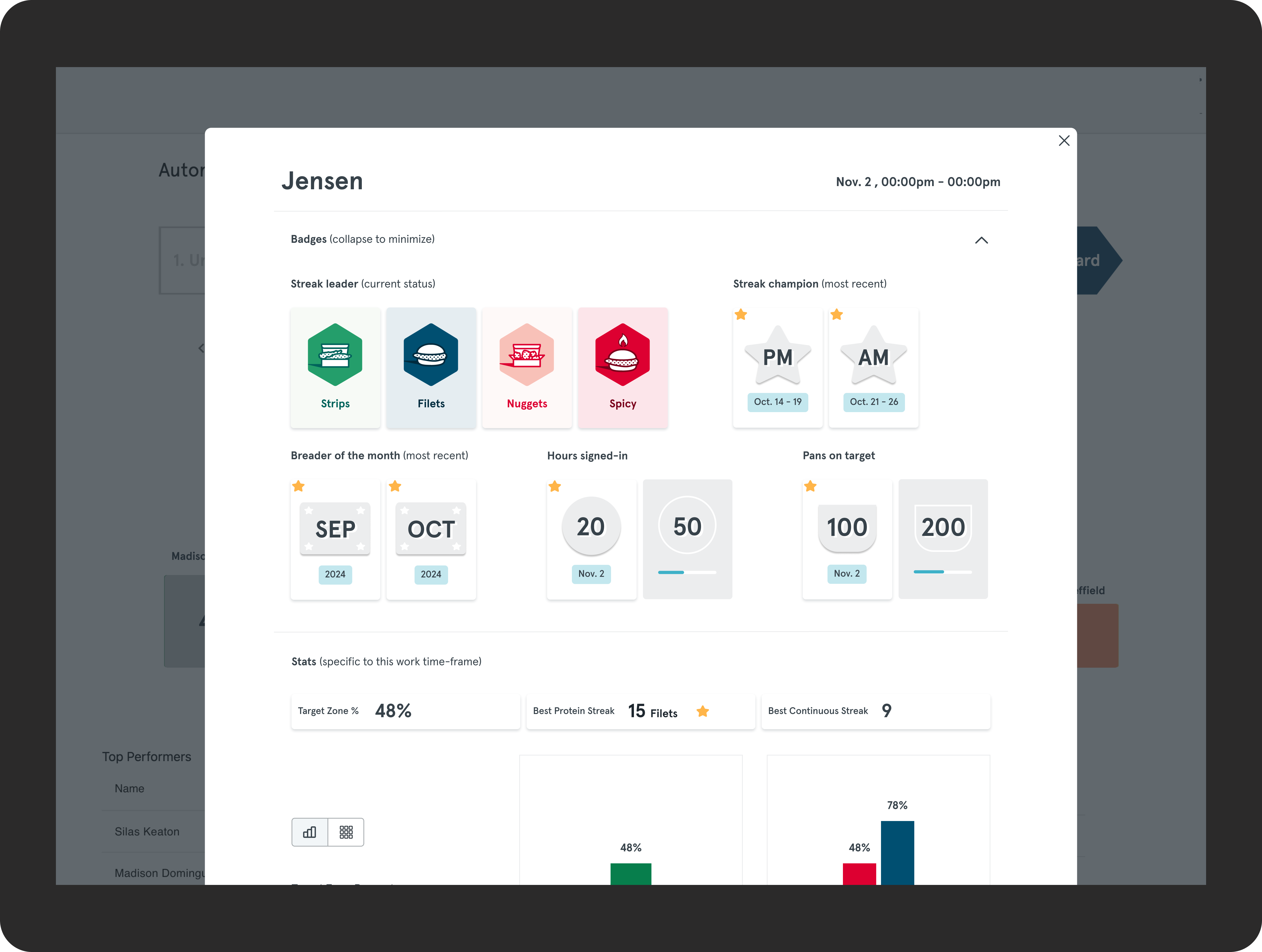
Training was long, repetitive, and lacked engaging reinforcement — particularly for new team members.
Solution: A scalable badge and performance system designed to motivate, educate, and reinforce accuracy.
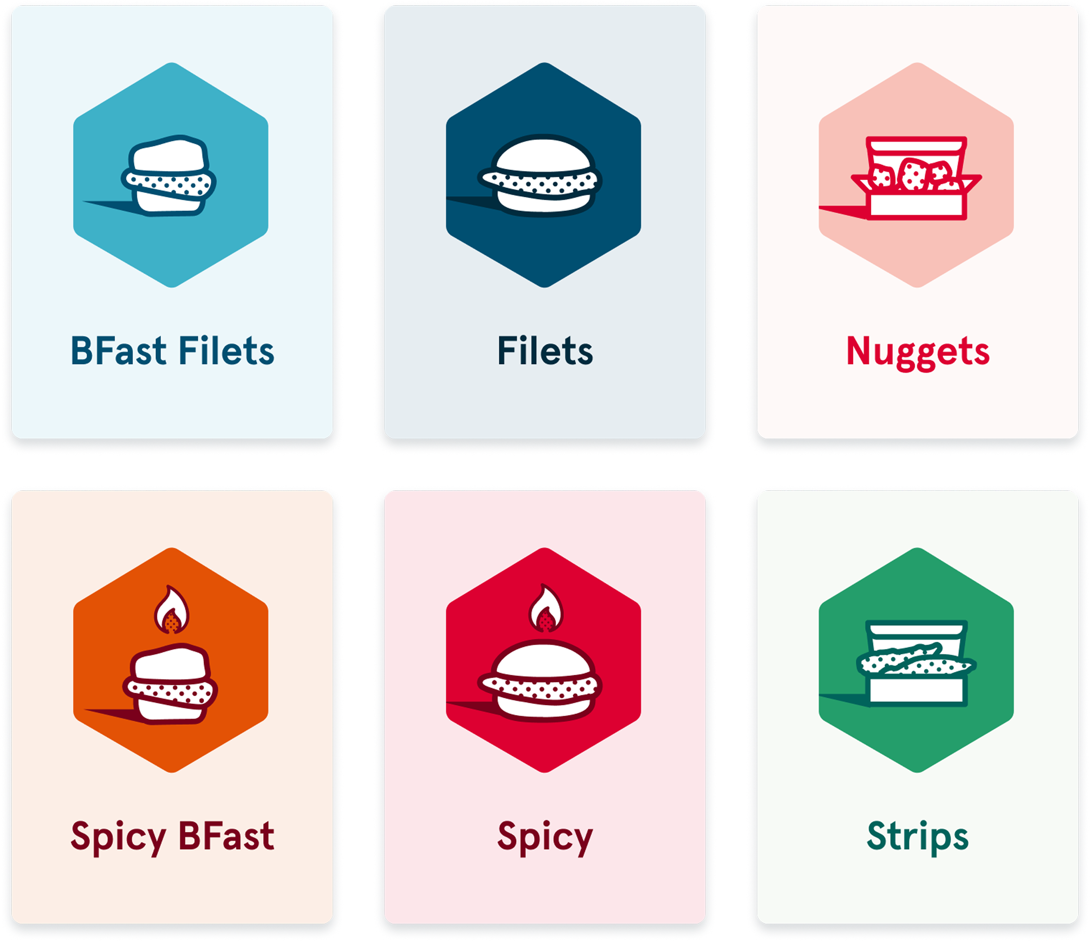
Ideated and refined 50+ badge concepts, clustered into:
- Milestone achievements
- Real-time competition (e.g., “Protein Streak Leader”)
- Performance streaks (daily/weekly consistency)
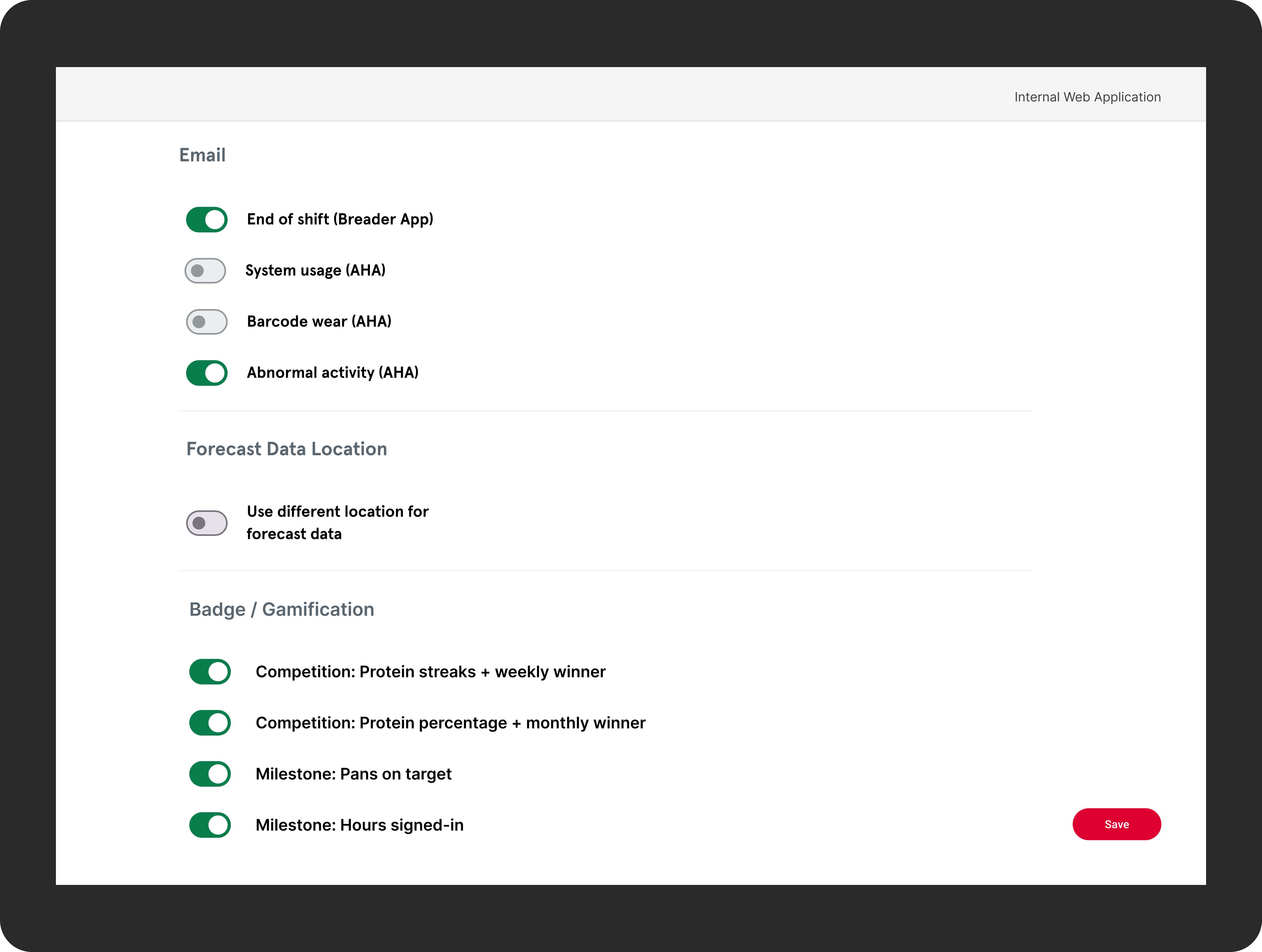
Designed badge visuals, logic, and notification patterns tied to real workflows. Introduced a reporting dashboard for team leads with training progress, error trends, and badge achievements. Created opt-in controls for operators to align gamification with local culture.
- 50% reduction in training time
- 30% increase in production speed
- Higher engagement and adoption from team members and leads
.png)
— 30% improvement in production speed
— 50% reduction in training time
— 40% fewer errors at the breading station
— Accessible interfaces scaled to 250,000+ team members
— Deployment across 2,500+ restaurant locations
— Established design as a strategic partner to operations and training
— Introduced scalable design system patterns adopted across modules
— Reduced redundancy and improved delivery velocity across cross-functional teams
— Increased team member satisfaction and daily workflow confidence
As a design leader working in high-volume operational environments, I learned:
— Accessibility drives speed and accuracy, not just inclusiveness.
— Modular systems are essential when designing for thousands of distributed, variable environments.
— Cross-functional alignment early eliminates costly downstream divergence.
— Frontline immersion reveals workflow gaps no digital audit can uncover.
— Gamification works when it’s optional and culturally sensitive, not forced.
Through strategic design leadership, cross-functional alignment, and deep operational immersion, I transformed a fragmented suite of legacy kitchen tools into a unified, accessible, and scalable UX platform for Chick-fil-A. The redesign improved production speed, reduced training time, lowered error rates, and strengthened daily workflows for hundreds of thousands of team members.
This work demonstrates how human-centered systems design — anchored in frontline insight, operational rigor, and scalable technology — can deliver measurable business value at enterprise scale.