
As Product Design Director, I was recruited by the CEO at a critical growth inflection point to solve a growth ceiling problem disguised as a feature problem. I reframed IONSPORT's IONCOURT app from a high-stakes scoring utility for officials into a fan-driven ecosystem — unlocking significant growth while explicitly protecting the mission‑critical workflows that earned the platform its original trust.
“We had built a fortress, but we forgot to build a front door.”
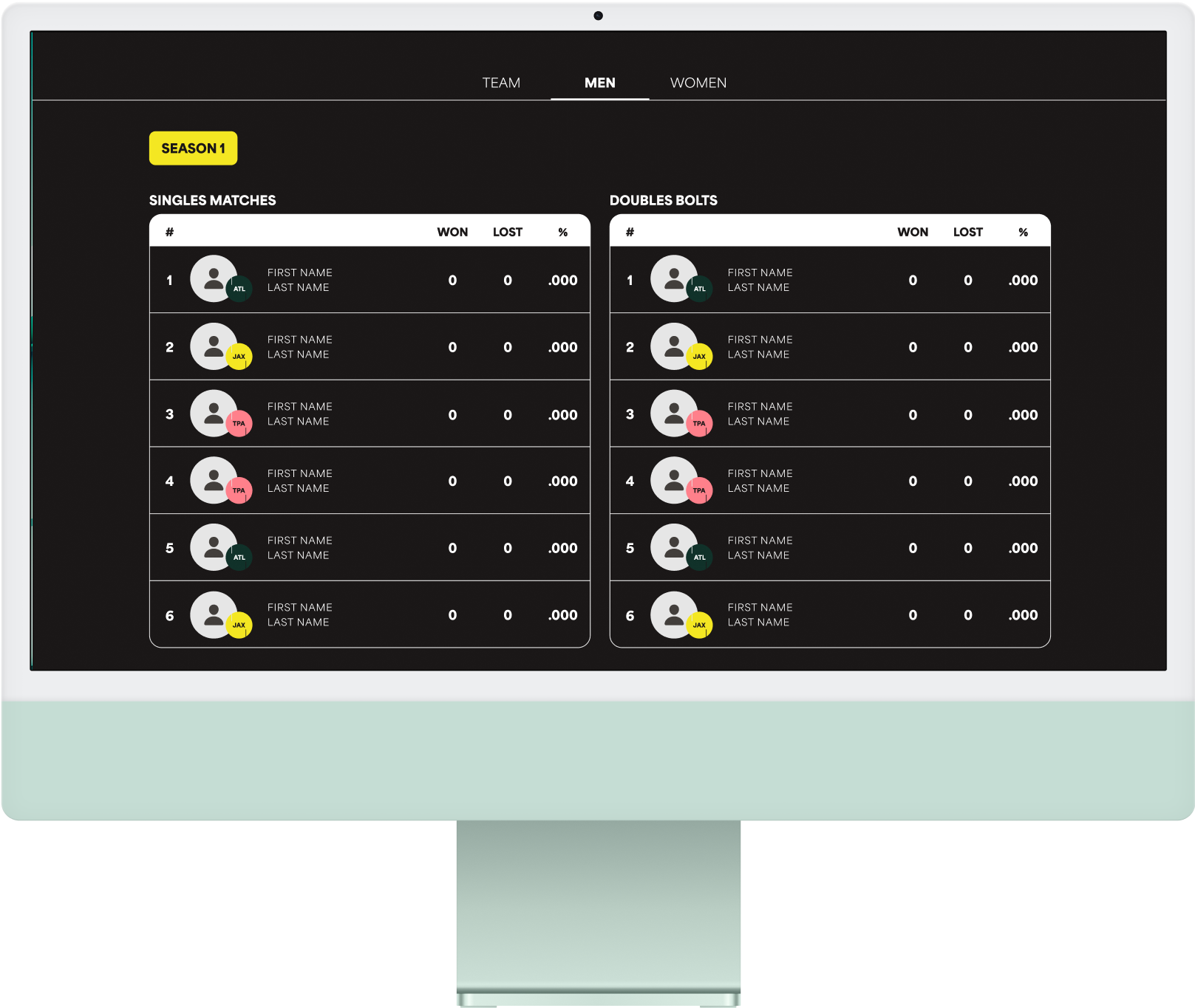
When I joined, IONCOURT was the gold standard for officials. The product was optimized for high‑pressure, live match scoring where failure wasn’t an option and we provided them a direct line to us for support and feedback in the app and on WhatsApp. But growth had flattened. Fans found the product difficult to understand, disengaged once matches ended, and organizations lacked a scalable way to engage their audiences. The existential tension was clear: How do you pivot toward a high‑growth fan audience without breaking trust with the power users who generate the core data?
To reduce risk in a high-stakes product shift, I led a mixed‑methods research approach combining qualitative and quantitative signals:
– Remote and in-person user interviews across officials, fans, coaches, and organizers
– Surveys to validate adoption barriers and segment needs at scale
– Moderated usability studies focused on onboarding, live‑match confidence, and post‑match engagement
– Product analytics to identify drop‑off points, repeat usage patterns, and feature adoption
This triangulation allowed us to separate perceived problems from actual behavior, protect mission‑critical live workflows, and confidently target fans as the primary growth lever.
Research revealed a clear asymmetry:
– Officials were already retained and highly sensitive to change
– Fans were not retained and represented the largest untapped growth lever
– Organizations wanted fan engagement but lacked internal resources
Further optimizing for officials would deliver diminishing returns. Designing intentionally for fans — while explicitly protecting live‑play workflows — was the highest‑leverage opportunity. This reframed design as a primary driver of growth rather than a delivery function.


To align the company around this shift, I led cross‑functional workshops with leadership, product, and engineering to reframe the challenge from improving an app to designing a connected ecosystem.
North Star Vision
Create a living ecosystem where every fan feels part of the game — anywhere, anytime.
Experience Principles
– Clarity over complexity
– Engagement through context
– Don’t disrupt live play
– Accessibility as a baseline
– Design for repeat engagement, not one‑time use
These principles aligned design, product, and engineering around a common decision framework, accelerating tradeoffs under pressure. By tying them to measurable engagement and retention KPIs, we ensured design decisions drove business outcomes and shared accountability across teams.
Decision 1:
Audience Prioritization — Retained vs. Growth
The tradeoff: Continue incremental improvements for officials (low risk, capped growth) or prioritize fan adoption (higher risk, scalable upside).
The move: I designated officials as a protected class — freezing their live‑play workflows against disruptive UI change — while redesigning the broader ecosystem for fans.
Outcome: Maintained official retention while unlocking fan adoption, organizational promotion, and ecosystem expansion.
Decision 2:
Entry Point Friction — Generic vs. Contextual
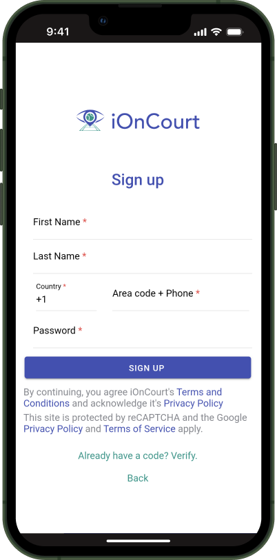
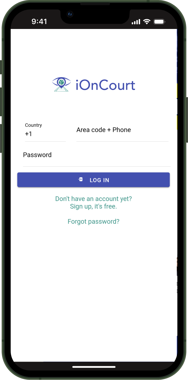
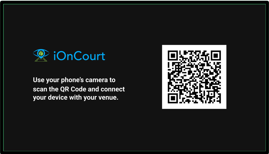
The move: Match‑first entry through contextual activation.
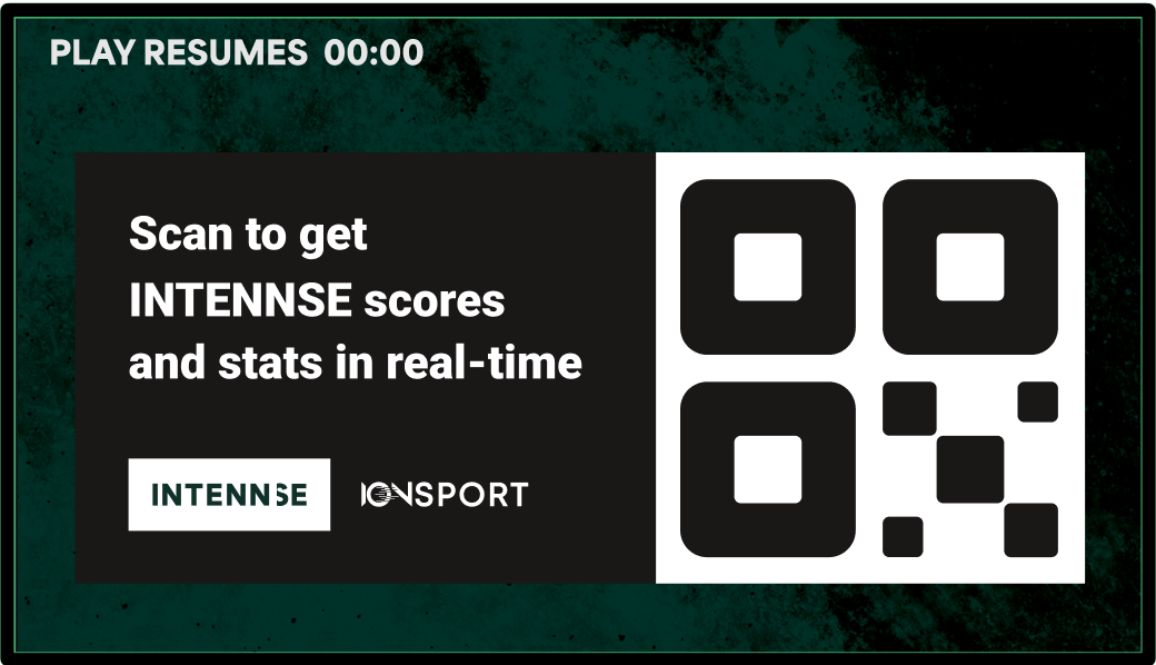
– QR‑based entry tied to live events.
– Deep links directly into specific matches or tournaments.
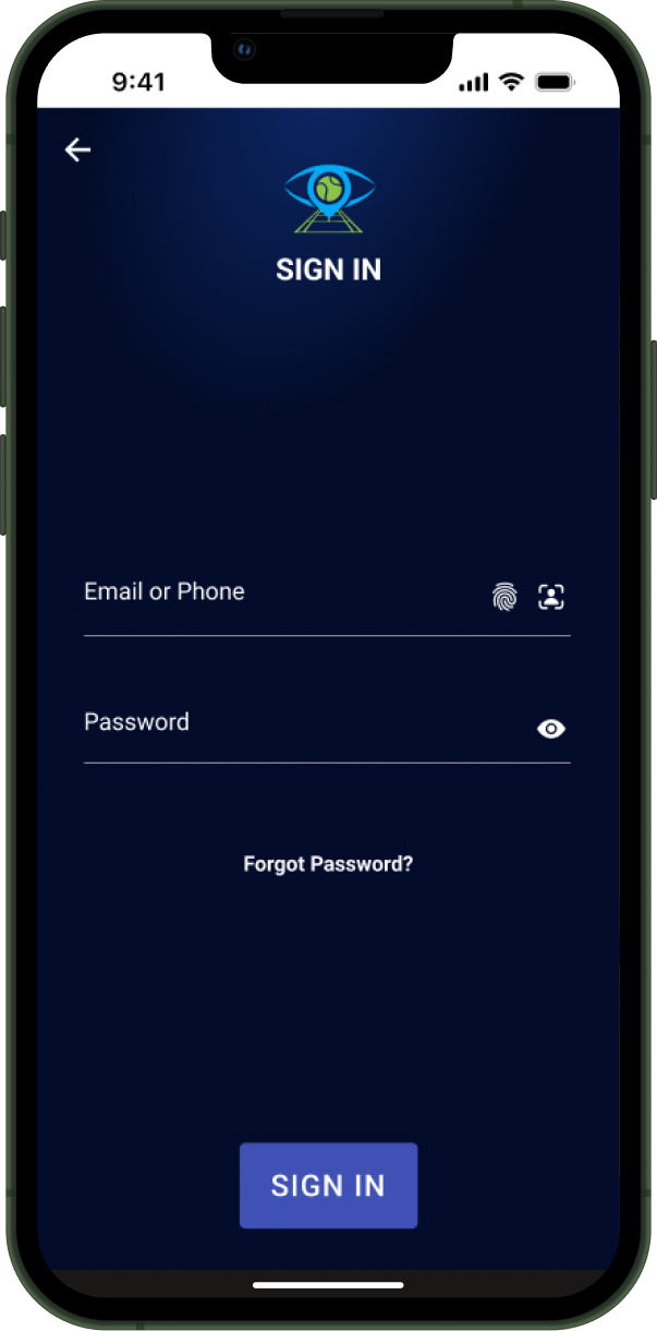
– Minimal steps before seeing live scores including an option to set up biometric sign-in
Outcome: Reduced onboarding friction and delivered faster time‑to‑value for first‑time and existing users.
Decision 3:
How Do We Drive Retention Beyond the Match?
The move: A role‑aware, follow‑based engagement model.
– Users followed players, teams, tournaments, and organizations
– The UI adapted based on who the user was and what they cared about.
Outcome: Meaningfully increased repeat usage by making the product feel relevant only when the things users cared about were active.
With a lean team and aggressive timelines, scale was non-negotiable.
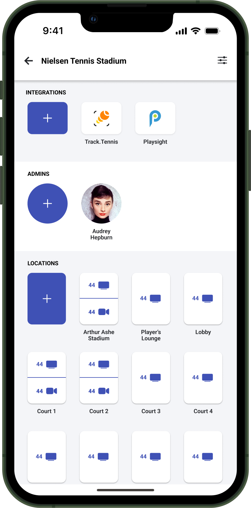
I established lightweight design operations and built a multi-platform design system spanning mobile, TV, web, watch, and venue displays. The design system was developed and maintained in Figma and intentionally aligned with Jira workflows so design decisions translated cleanly into engineering execution.
Alongside system ownership, I remained a hands-on designer on the most critical and high-risk surfaces—personally designing core flows, interaction models, and UI patterns where clarity, trust, and speed were essential.
This included:
– Designing key fan entry, onboarding, and follow-based engagement flows
– Leading interaction and visual design for live match views and navigation changes
– Prototyping and validating concepts directly with users before scaling them through the system
System principles:
– Reuse where speed and consistency mattered
– Customize where differentiation mattered
– Accessibility as a baseline, not a retrofit
These systems improved engineering velocity, reduced design-to-development friction, and enabled enterprise-level quality despite limited runway.

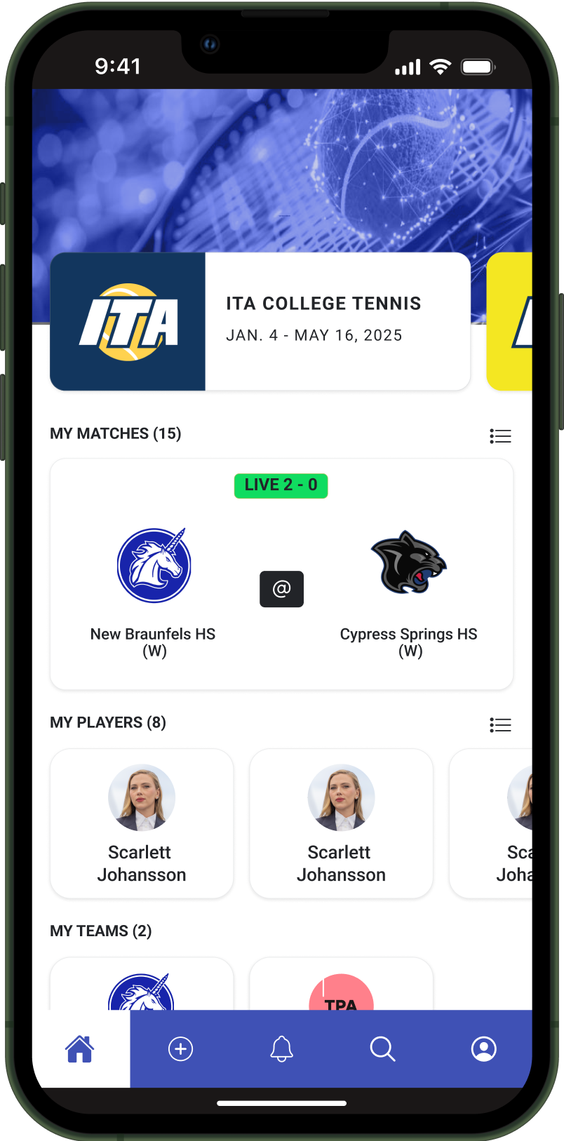
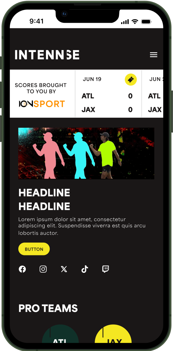
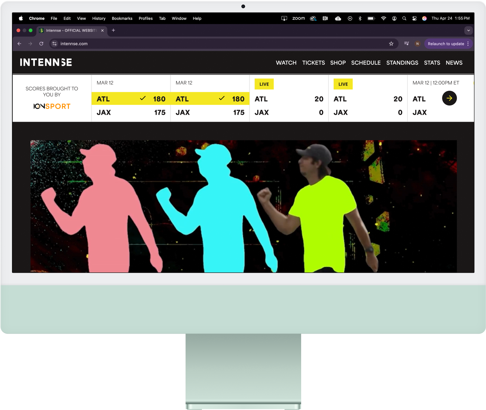
The redesign reframed the IONCOURT app from a utility used during matches into a platform fans returned to before, during, and after play.
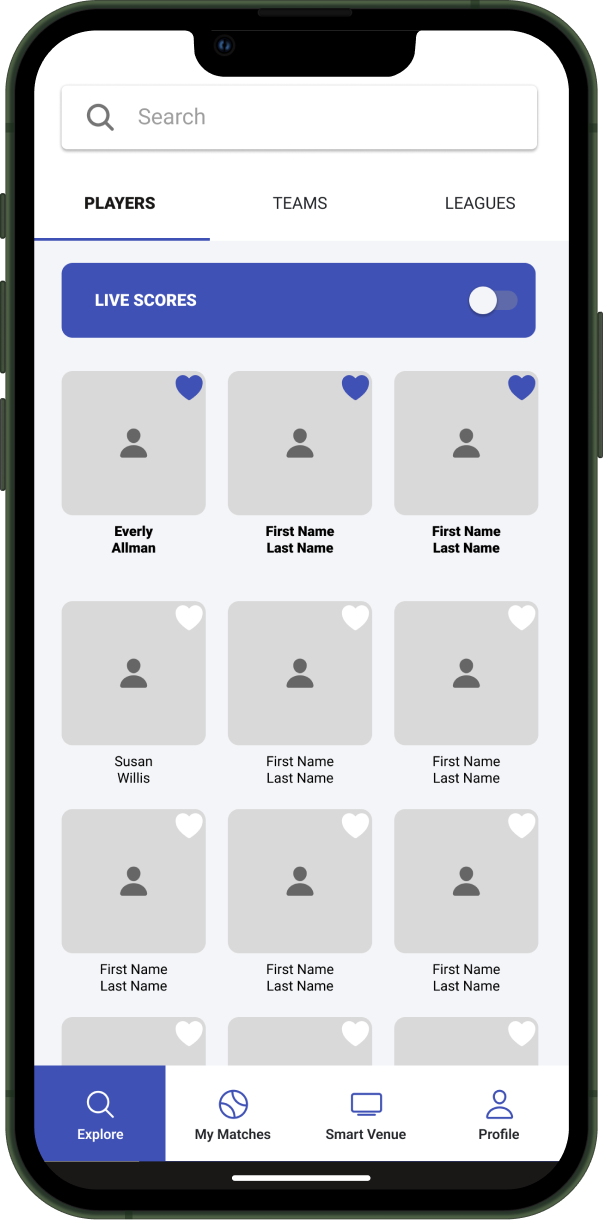
Navigation & Information Architecture
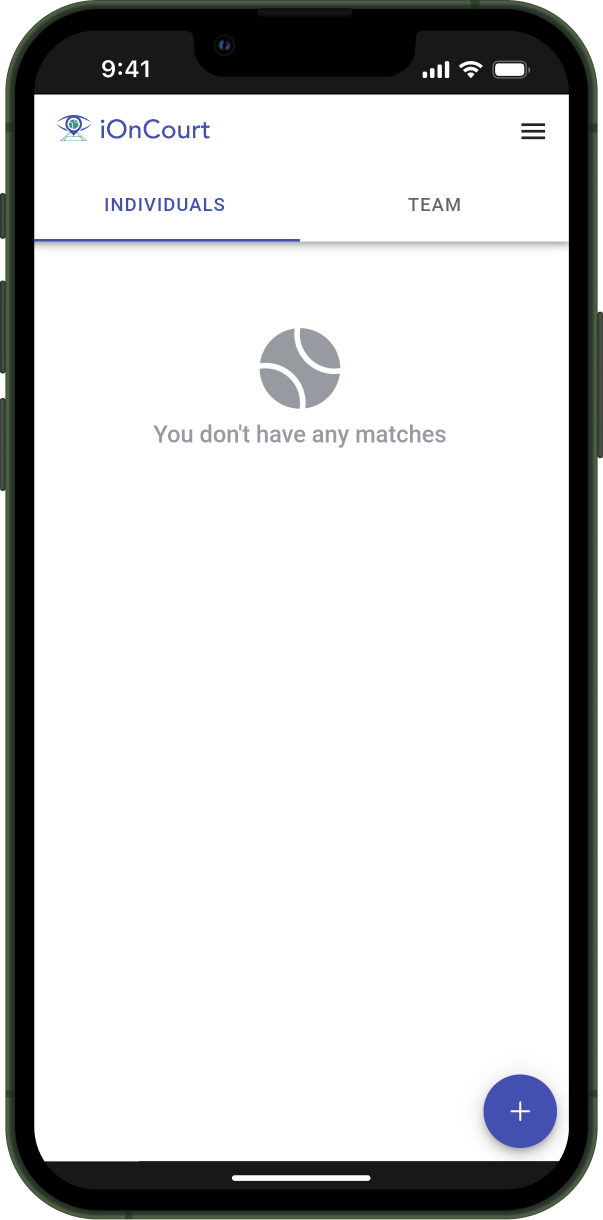
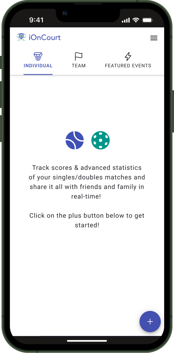
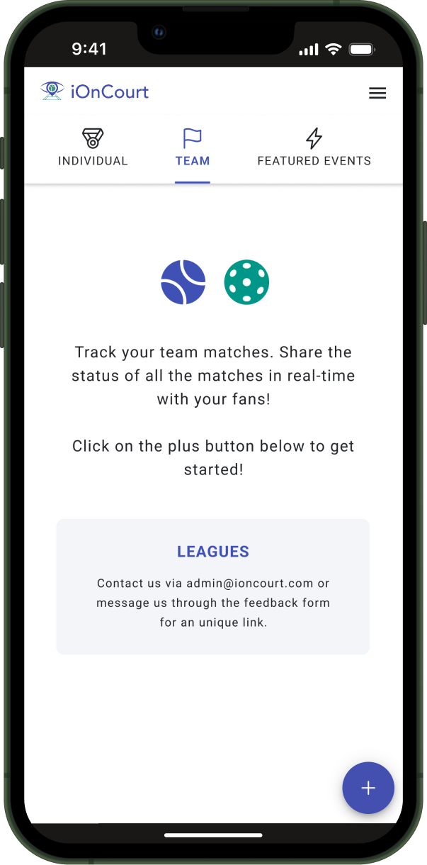
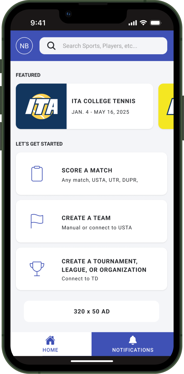
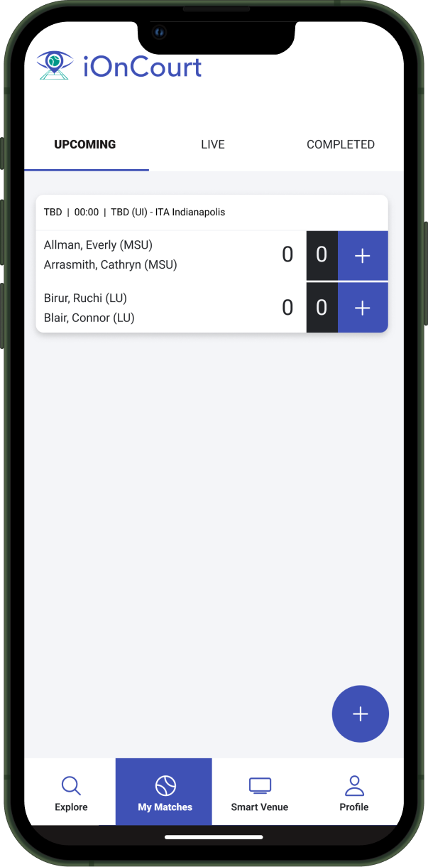
The original navigation centered the scoring tool — ideal for officials, limiting for fans.
What changed:
– Introduced persistent navigation surfacing fan entry points
– Preserved immediate access to scoring to avoid disrupting live play
– Rebalanced hierarchy around fan mental models
This allowed fans to discover and return without introducing friction for officials.
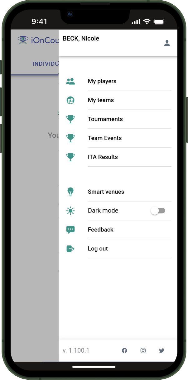
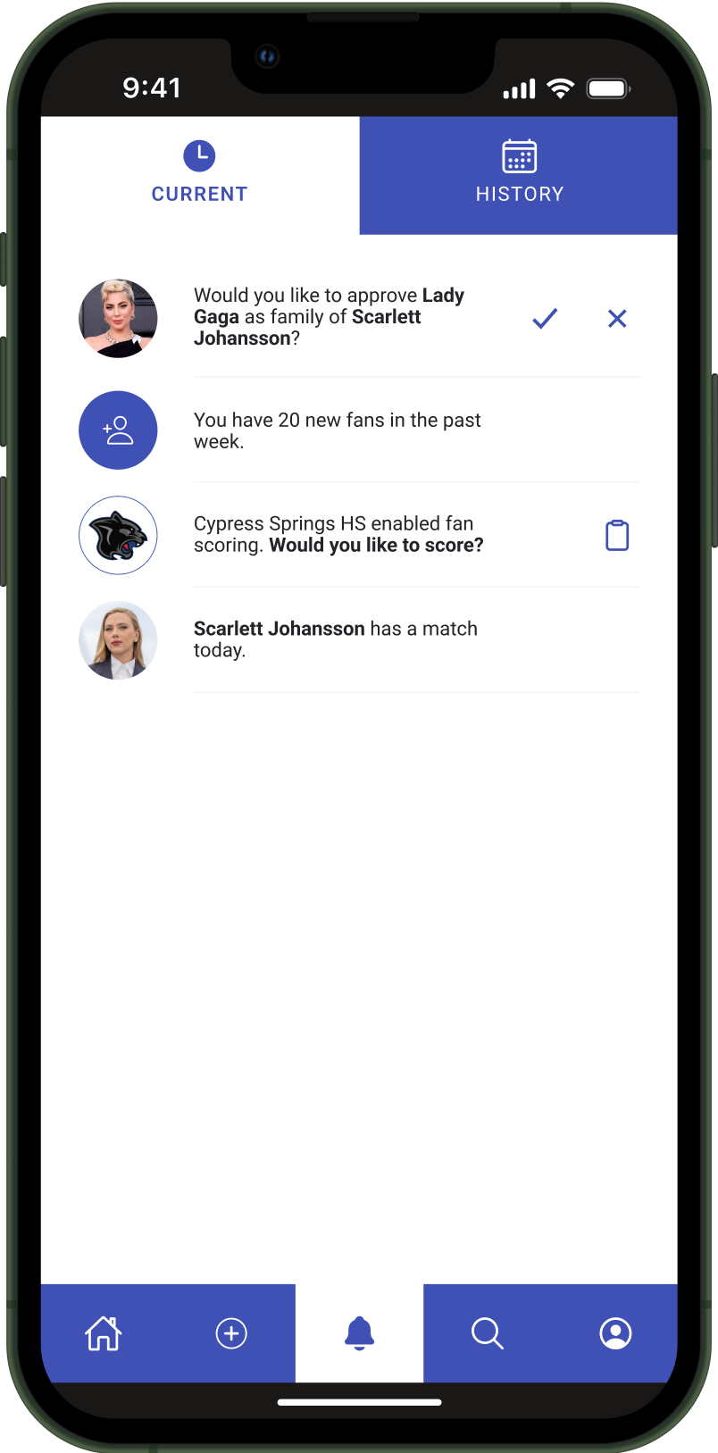
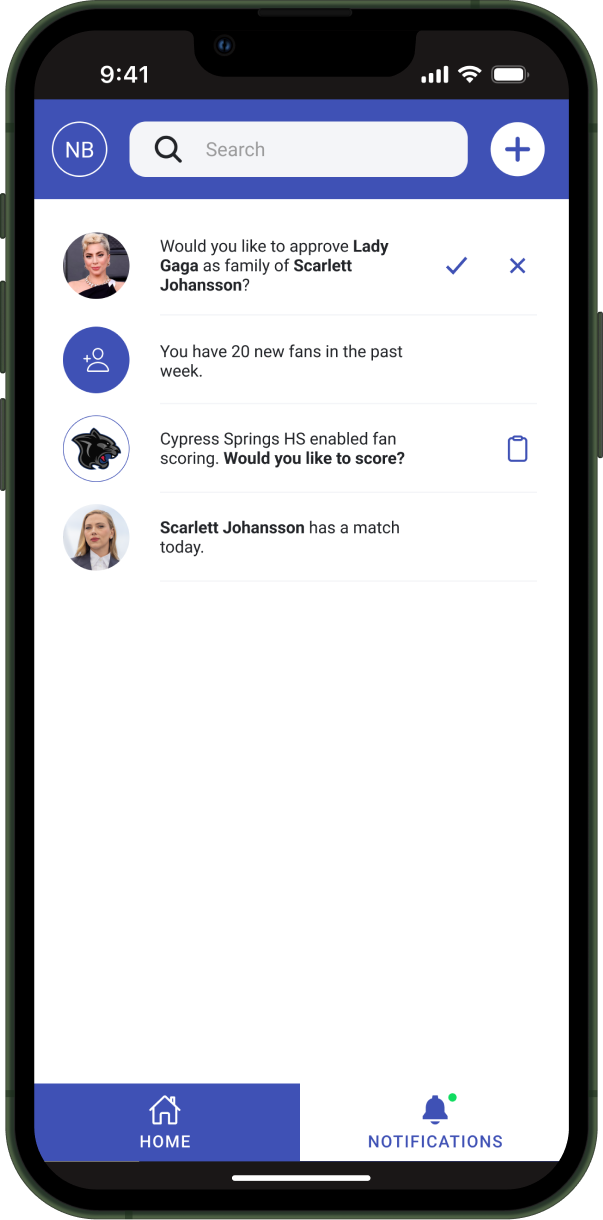
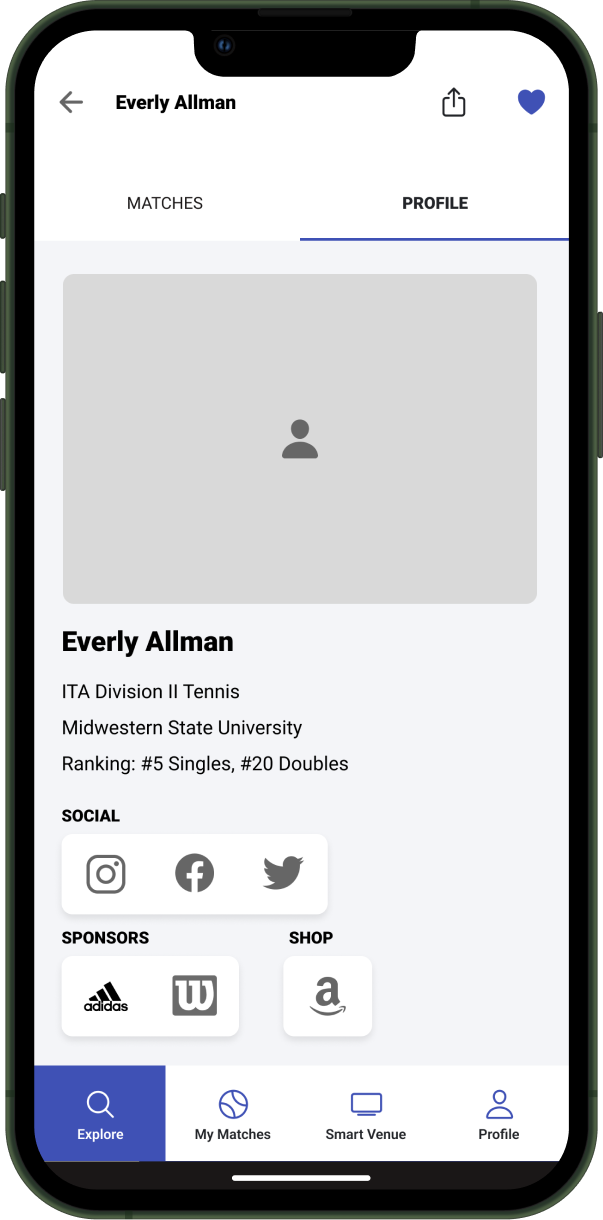
Role‑Based Engagement & Notifications
Notifications were redesigned around why someone cared, not just what happened.
– Fans received updates tied to followed entities
– Coaches, players, and admins could enable interactive fan features
– Prompts invited participation rather than passive awareness
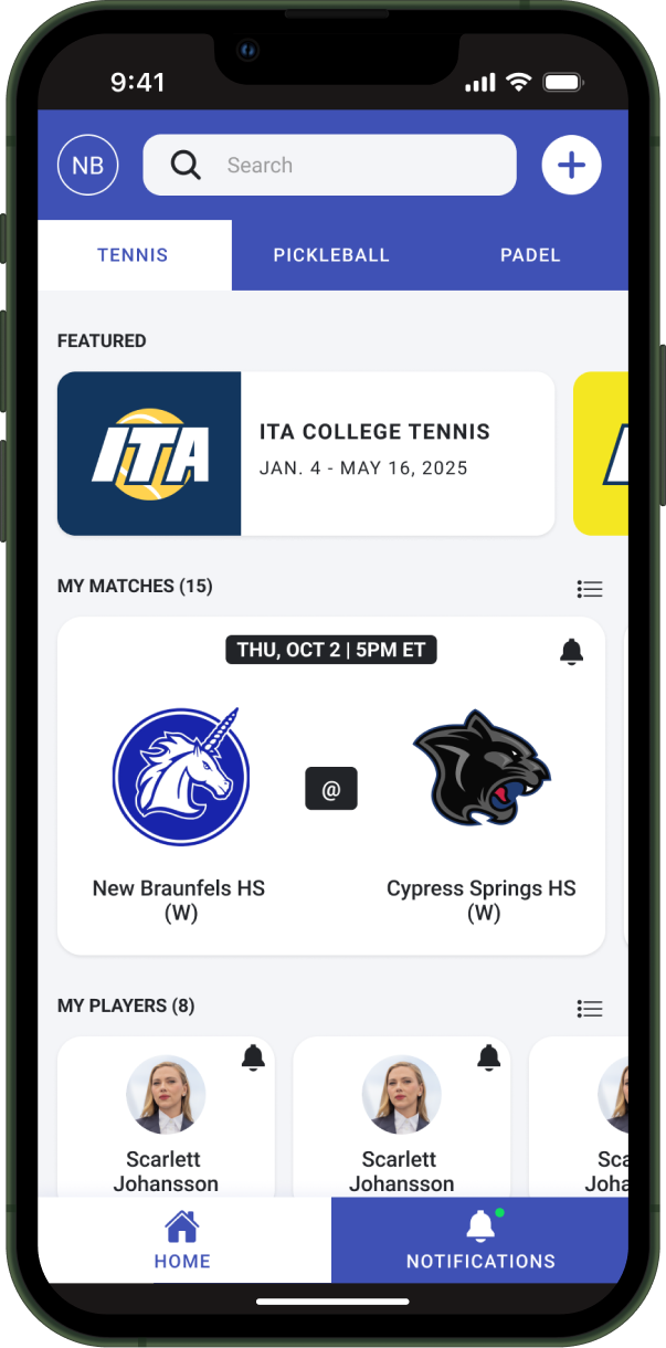
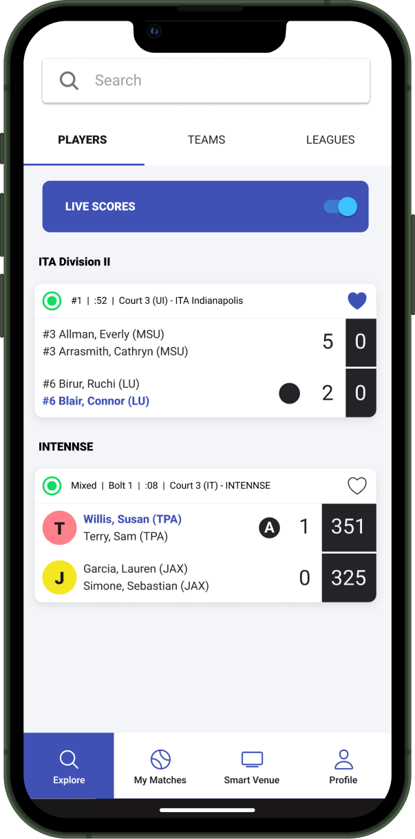
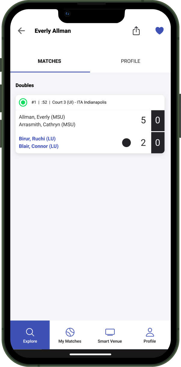
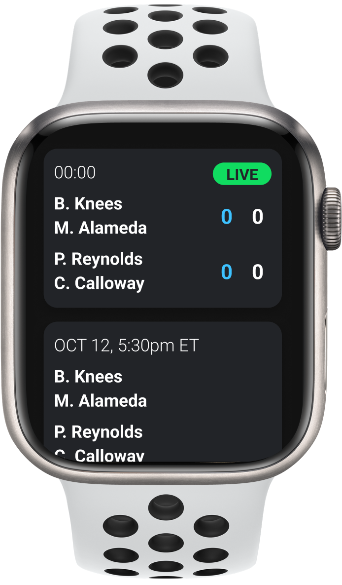
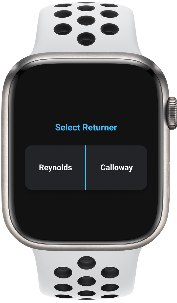
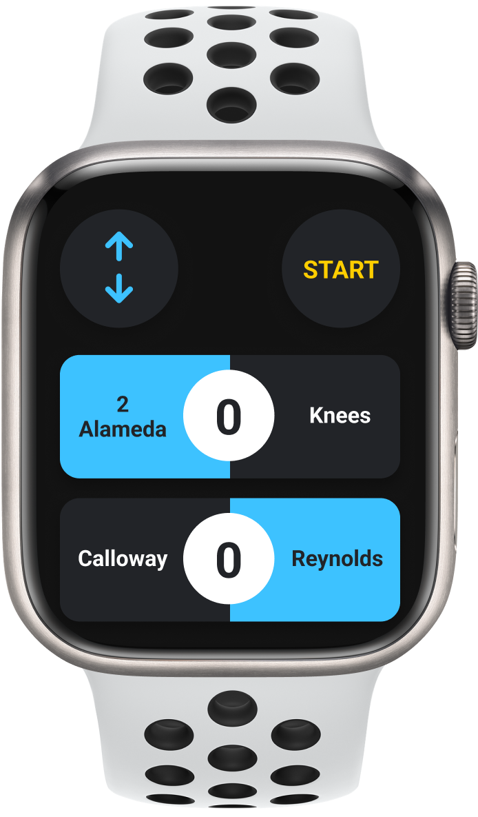
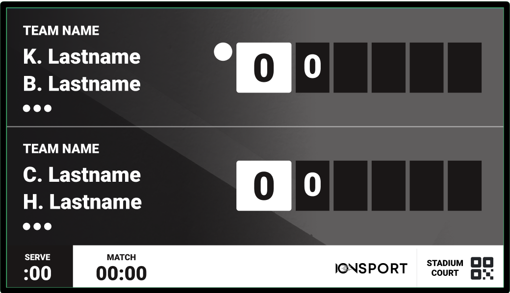
Live Match Context & Continuity
To preserve trust during exploration, I introduced a persistent, dynamic live‑scoring header.
– Adapted automatically for different match formats
– Maintained score visibility while browsing stats
– Reduced cognitive load during live play
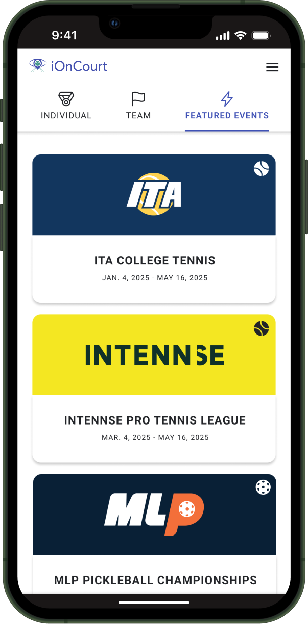
Context: We worked in lean iterations, balancing quick wins with the long-term vision. Because the app was originally built for officials, fans struggled with discovery and context.
Idea: I proposed low-risk updates—surfacing featured events in the tab navigation with a new UI card component, enhanced tab UI, and added contextual empty states—that were easy for engineering to ship.
Validation: User interviews, in-product feedback, and traffic analytics before, during, and after events confirmed that surfacing events improved fan understanding and engagement—validating discovery as a key lever in the fan experience.
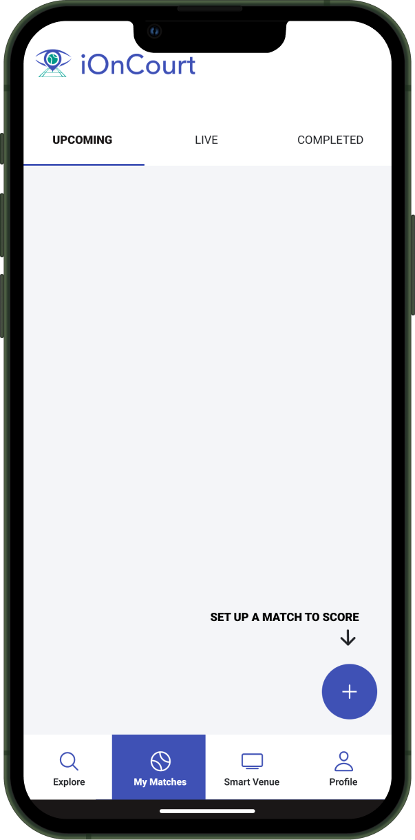
Context
Incremental improvements were gaining traction, but fans still struggled to return to and find specific matches, teams, or players. The experience continued to favor task-based actions over fan discovery and personalization.
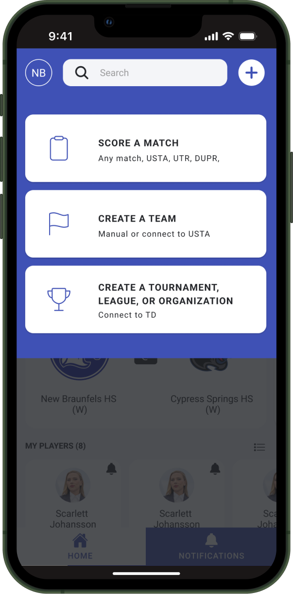
Idea
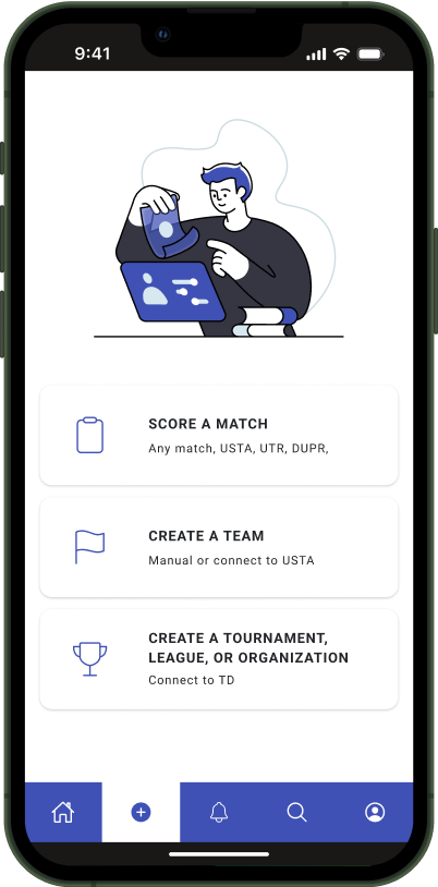
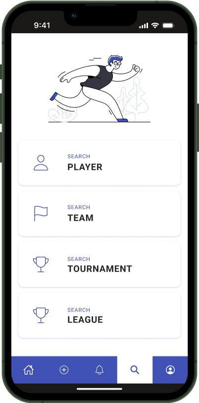
I proposed a fan-prioritized bottom navigation that preserved core actions (unofficial and official scoring, team creation) while restructuring the information architecture around fan needs.
This enabled fans to:
– Personalize their home experience by following matches, players, teams, and tournaments
– Receive in-the-moment notifications (e.g., permission to score during live play, match results, and stats)
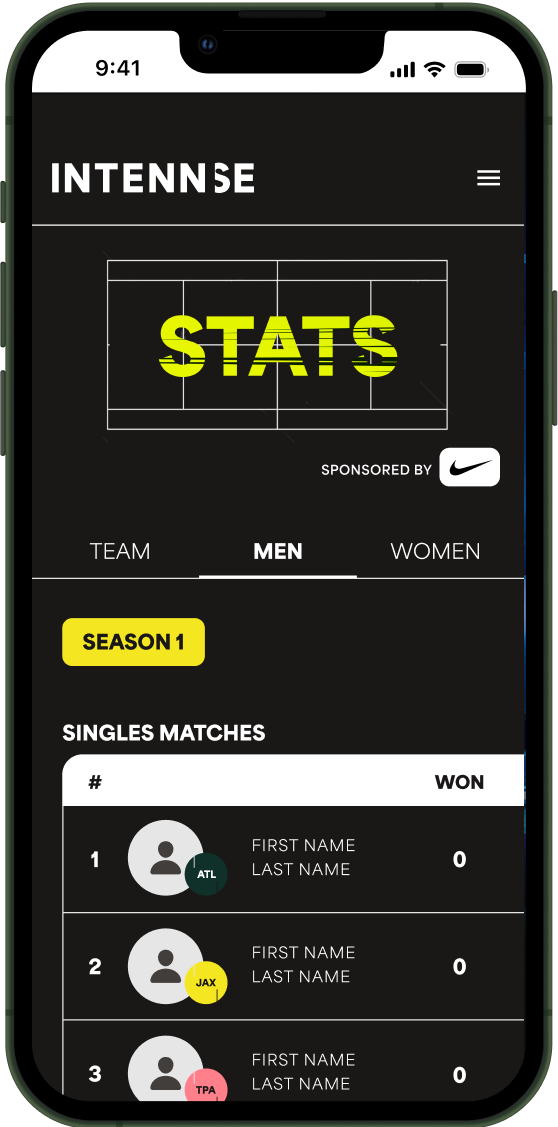
– Search content by clear categories
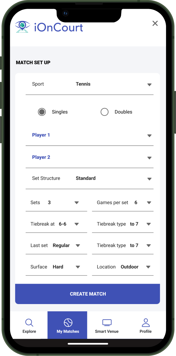
The existing “+” create button ensured officials could continue their workflows without disruption.
Validation
User interviews and usability testing were overwhelmingly positive. Fans discovered capabilities they didn’t know existed—such as fan scoring—and reported that personalization made them more likely to return.
High-fidelity prototypes were also tested with coaches, officials, and organizers:
Officials remained confident because their live-play experience was unchanged
Coaches and organizers saw clear potential for increased fan engagement
Parents valued real-time access to scores and stats without relying on group texts
Together, this validated the navigation shift as a fan-growth lever that preserved trust with core users.
.png)
.png)
Context
Option B
Option B prioritized the same core information as the selected design but introduced a split navigation pattern, using both top and bottom navigation to organize content.
Option C
Option C emphasized exploration, scoring, and Smart Venue—a custom product developed as part of the fan experience. Smart Venue is detailed further in the ecosystem expansion section below.
Why These Options Didn’t Move Forward
Option B
Option B tested positively with users and performed comparably to the selected direction. Ultimately, the decision came down to stakeholder alignment and technical feasibility. The split navigation pattern introduced additional complexity, including maintaining both top and bottom navigation, sport-based sub-tabs, and a universal search that needed to support multiple content types. Given the increased engineering effort and long-term maintenance considerations, the team chose a simpler navigation model that delivered similar user value with less technical risk.
Option C
Option C also tested positively with users, particularly around exploration and scoring. The primary point of uncertainty was the Smart Venue navigation item, which was expected given that it represented a completely new product offering. While users understood the concept when explained, the business ultimately decided not to elevate Smart Venue as a primary navigation element until the product strategy, positioning, and rollout plan were more fully defined. The team chose to defer broader exposure until the business felt confident in its long-term investment and success metrics.
As fan engagement increased, organizations began actively promoting the platform. This momentum enabled expansion beyond the core app:
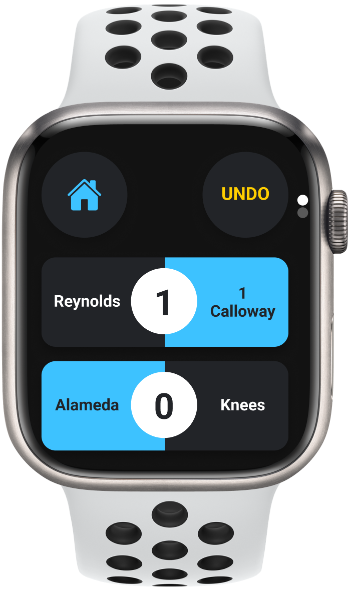
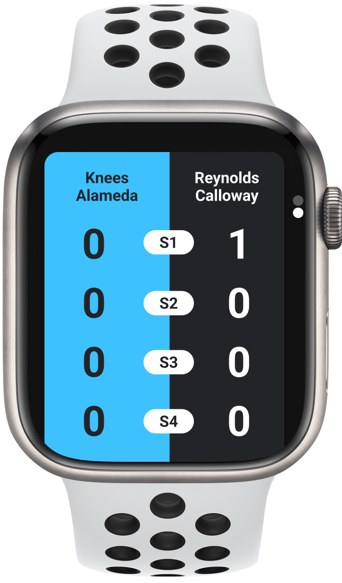
– Smartwatch app for real‑time, on‑court scoring for pickleball and tennis.
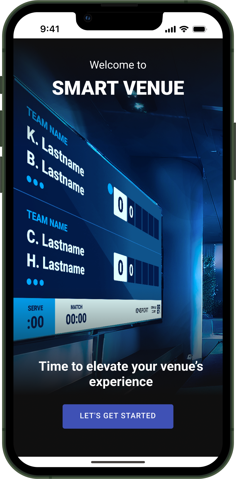
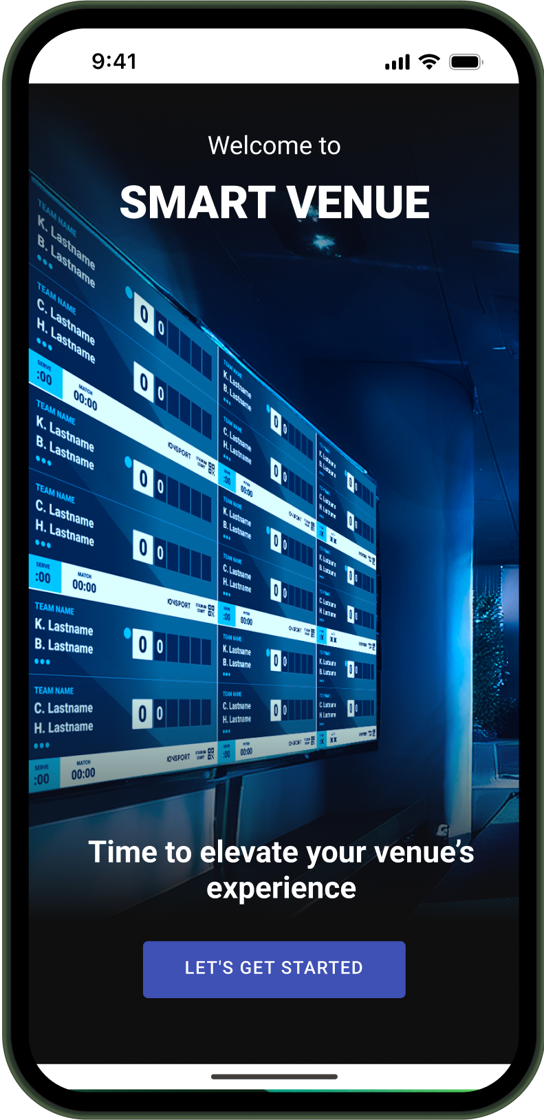
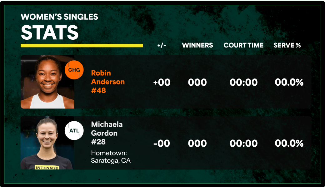
– Smart venue product that enabled organizers to control on-court and off-court cameras and TV screens directly from a mobile device. The system supported default and custom scoreboard designs, multi-match score views, player and team stat screens, and flexible venue configurations — transforming live events into fully controlled digital experiences that enhance the in-person fan experience.
– CMS templates allowing organizations to embed live scores and stats on their own sites.
Each product reinforced the ecosystem, created new entry points, and unlocked monetization opportunities.

– 50%+ user growth in six months
– Increased global organizational adoption and platform visibility
– Maintained official retention while expanding the audience
– Established IONCOURT as the leading racket sports scoring and data platform
– Design positioned as a growth and strategy partner
– Clearer decision‑making through shared principles
– Improved cross‑functional trust and execution speed
– I frame growth ceilings as design problems, not feature gaps
– I protect core users while intentionally designing for new ones
– I make tradeoffs explicit so teams can move faster with confidence
– I treat systems as enablers of speed, not bureaucracy
– I lead through alignment and clarity, not control
At IONSPORT, my role wasn’t just to improve an interface — it was to guide the company through a high‑stakes transition from utility to ecosystem. By making tradeoffs visible, grounding decisions in user context, and aligning teams around shared principles, we unlocked sustainable growth without sacrificing trust. This is how I operate as a senior design leader: clear framing, intentional decisions, and measurable impact.